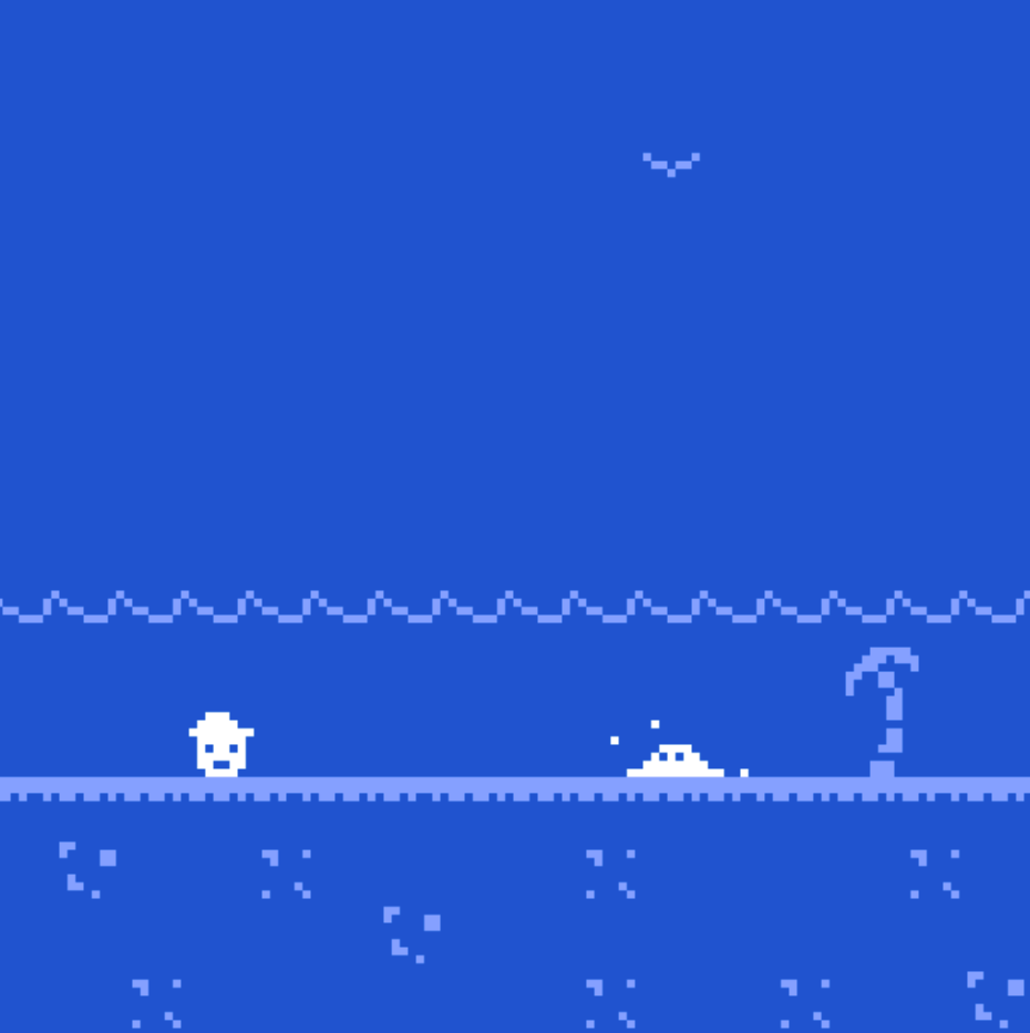
The spaces and rooms in this game were clearly defined and worked with elements of both time and space. The decision to start the game with the indication of "Day 1" made it clear to me that I might progress through multiple days as the game progressed. As a player, I first went to the object on the right, and upon finding out that I needed to keep looking for the treasure, I went to the left and found the little house with the door. The door very clearly indicated that it led to something/that it was an exit, so that was my natural next step. As I did, I was taken to day 2 and day 3. This was a way of moving the player (me) through time. Within each day, there was also an element of moving in space and I knew to walk towards the right to explore as the first day primed me to do so. The "sea floor" space element of each level/day didn't necessarily seem to be a small or notably vast space. It may have conveyed a sense of "still digging" if the space was a bit larger, but it may have also been frustrating as a player so the space of each level seemed reasonable to me. The whole game and the rooms were conveyed in a fairly linear format with moving from day to day and then searching for treasure on each level. It was also pretty clear to me that the object on the right was what would instruct me, and then the space on the left near the door was where treasure (or trash) might be located.
Playing this game, the monochromatic use of the color blue is one of the first things I noticed. The blues you use are very saturated and reminiscent of the kind used on arcade games. They are bright and eye-catching, giving off the mood that this game will be an upbeat one rather than one filled with melancholy. In the context of the game, I associate the use of blue to be with that of the ocean surrounding the island that the player is stranded on as well as the open blue of the sky. I think its also important that you chose to use the same color palette throughout when you could have changed the tonality of blues to indicate the progression of time on the island as the day goes on or the seasons changing on the island. Instead, by keeping with the same color palette, the player is made to feel as though time is stagnate as they are stuck on the island. The only change we see is the person digging for treasuring going deeper and deeper into the ground as the days go on. The similarity in hues of the blues used in the background tiles I would estimate were purposeful so as to make the player feel like they were in great open waters. The horizon line indicated by the line of waves is the only thing that breaks up the clear blue. There is otherwise no separation between the water and that of the sky, which to me while I was playing the game had me equally edge as the saturation of blues calmed me.
Comments
Log in with itch.io to leave a comment.
The spaces and rooms in this game were clearly defined and worked with elements of both time and space. The decision to start the game with the indication of "Day 1" made it clear to me that I might progress through multiple days as the game progressed. As a player, I first went to the object on the right, and upon finding out that I needed to keep looking for the treasure, I went to the left and found the little house with the door. The door very clearly indicated that it led to something/that it was an exit, so that was my natural next step. As I did, I was taken to day 2 and day 3. This was a way of moving the player (me) through time. Within each day, there was also an element of moving in space and I knew to walk towards the right to explore as the first day primed me to do so. The "sea floor" space element of each level/day didn't necessarily seem to be a small or notably vast space. It may have conveyed a sense of "still digging" if the space was a bit larger, but it may have also been frustrating as a player so the space of each level seemed reasonable to me. The whole game and the rooms were conveyed in a fairly linear format with moving from day to day and then searching for treasure on each level. It was also pretty clear to me that the object on the right was what would instruct me, and then the space on the left near the door was where treasure (or trash) might be located.
Playing this game, the monochromatic use of the color blue is one of the first things I noticed. The blues you use are very saturated and reminiscent of the kind used on arcade games. They are bright and eye-catching, giving off the mood that this game will be an upbeat one rather than one filled with melancholy. In the context of the game, I associate the use of blue to be with that of the ocean surrounding the island that the player is stranded on as well as the open blue of the sky. I think its also important that you chose to use the same color palette throughout when you could have changed the tonality of blues to indicate the progression of time on the island as the day goes on or the seasons changing on the island. Instead, by keeping with the same color palette, the player is made to feel as though time is stagnate as they are stuck on the island. The only change we see is the person digging for treasuring going deeper and deeper into the ground as the days go on. The similarity in hues of the blues used in the background tiles I would estimate were purposeful so as to make the player feel like they were in great open waters. The horizon line indicated by the line of waves is the only thing that breaks up the clear blue. There is otherwise no separation between the water and that of the sky, which to me while I was playing the game had me equally edge as the saturation of blues calmed me.